
Ink: Tea Dye, VIntage Phot, Pumice Stone & Victorian Velvet Distress Ink
Stamps; Hero Arts, Stampers Anonymous
Other: Tim Holtz Tiny Attacher
I prefer my second attempt:
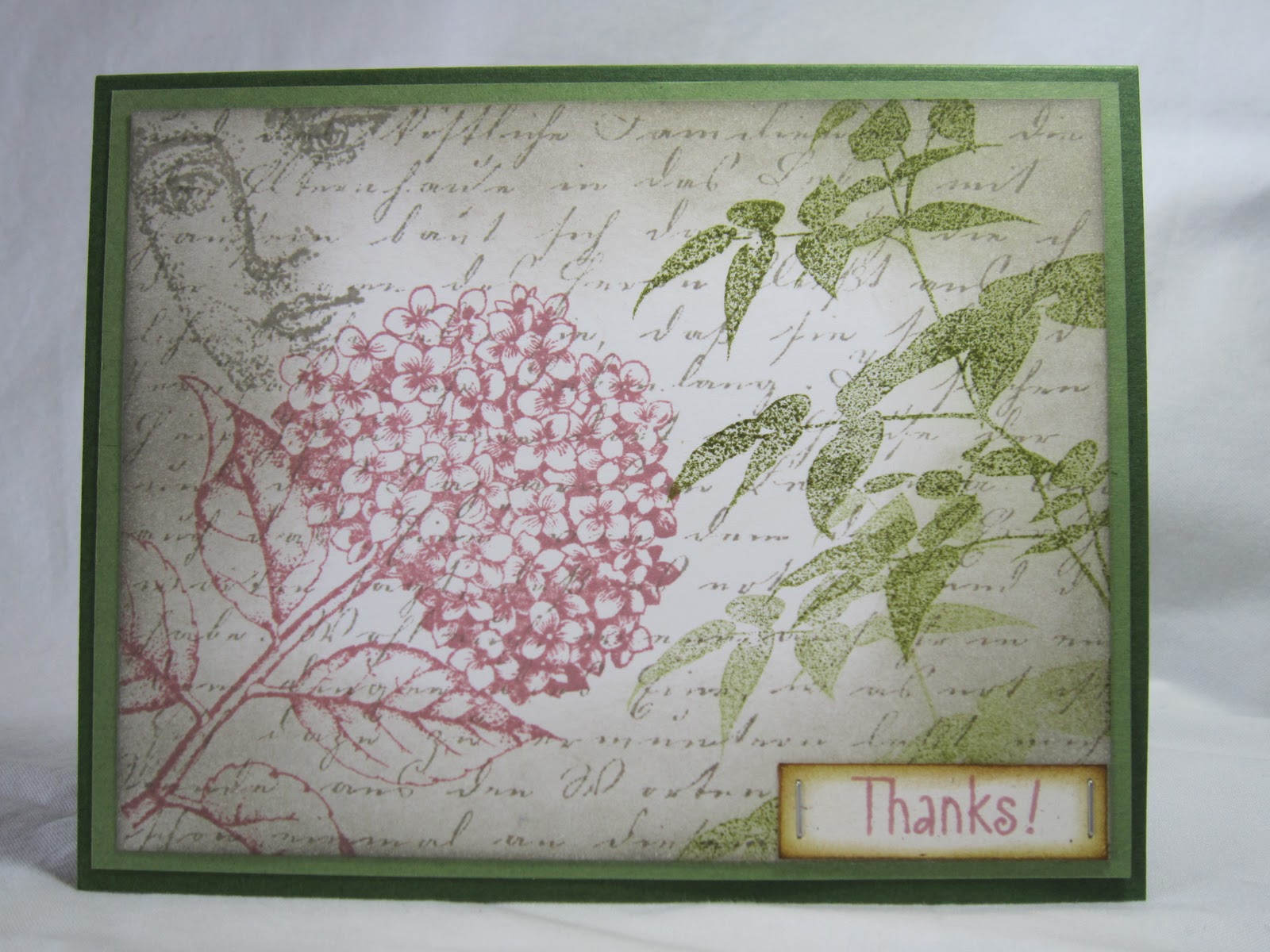
Ink: Pumice Stone, Forest Moss, VIctorian Velvet & Vintage Photo Distress Inks
Stamps: Hero Arts, Rubber Stampede
Other: Tim Holtz Tiny Attacher
I just love the stamp of that face peeking on the side. It's called "She Knows" from Rubber Stampede and I found it at Michaels. And in this card, I did want the tiny staples to be straight!
I still have a lot to learn! Tell me what you think, please, especially you ladies who are truly experts at this and whose work I admire so much!
Enjoy the rest of your Sunday! We just went and spent way too much on some skiing clothes for our Spring Break trip to Banff in Canada next month. This will be our first time skiing, and my daughters' first play in the snow! I am so excited for her!
12 comments:
I like both of them Brenda... but think the second one is nicer due to the softer green colours rather than the browner ones on the first. You have done well with your collage though. it doesn't look hotch potch but flows together beautifully
I think they are both beautiful!
I think that maybe you do not like the first one more than the second because the two flower images do not overlap or touch in any way and they are stamped in the same angle. Where as the flowers in the second image touch slightly and the flower on the right hand side is on a slight diagonal angle. I think that it is a difference of layout. I personally still like both. It is just that they are different from each other and different is always a good change from the ordinary.
All I can say is you are becoming a pro at collage very quickly! These are both so beautiful, Brenda!
Hi Brenda, these two cards are stunning and you did a awesome job. There is nothing wrong with your first card--it is beautiful.
both cards are lovely, brenda!
Both cards are lovely, Brenda!
Beautiful Brenda! I love the second one because the green softens it somewhat, but the first is beautiful too!
These are both beautiful Brenda, I agree with Jacqueline the green card is softer than the first but they are both beautiful.
They are both wonderful Brenda! The background is breathtaking!
These are stunning, Brenda! Your colours and sponging are so perfect.
Wonderful collage cards!! Just gorgeous!
Post a Comment